News
In colour, we learn and understand better
In colour, we learn and understand better
Why are fire trucks red1? The answer to this question may seem perfectly obvious to you: it is because red is THE colour for danger! And it is a colour that you can see very well, which is essential because such an emergency vehicle has to stand out.
However, red is far from being the most visible colour, especially at night. It would be much better if fire engines were a yellow-green colour, as this is the colour that is best and quickest to perceive, even from the corner of the eye and even in the dark2. This is why American school buses are yellow3.
Thanks to colour, we are therefore able to recognise with a single glance a vehicle to which we must pay particular attention. But colour has many other virtues: it can stimulate our memory and boost our understanding.
Colour and learning
Several studies have shown that the judicious use of colour can enhance understanding and memory. For example, Australian researchers have shown that the colour of the school’s examination room influences the performance of students in reading tests: the brighter the colour, the better the result.4
Reviewing the various studies related to the influence of colour on memory, Malaysian researchers concluded5 that “colour has the potential of increasing the chances that environmental stimuli are encoded, stored and recalled successfully”. In other words, colour can help us in the whole process of remembering, from encoding (i.e. acquiring new information using our five senses) to recall (retrieving information from our memory) to storage (keeping the learned information alive over time).
This “power of colour” is well known to the champions of memorization. Able to memorise thousands of decimals of π, random pages of a telephone book and much more, these memory athletes rely on techniques where colour plays a key role. Joshua Foer, author of a book on the subject, explains:
“the central idea of most memorization techniques is to turn the boring thing you’re trying to learn into something so colourful, so exciting, so different from what you’re used to, that it becomes impossible to forget.”6
Colour helps us to write the information into our memory by giving us an extra grip to hold on to. This ‘colour stimulus’ is an additional anchor for our memories. It has been proven that we remember colour images better than black and white ones: our memory is 5-10% better at recognising colour nature photos7.
Moreover, colours have always been used to classify “beings and things, animals and plants, individuals and groups, places and times, ideas and dreams”, writes colour historian Michel Pastoureau. Even today, we still classify by colour: alert levels, combat sport belts, the urgency of a case, etc. Classification means organisation: it is much easier to understand and retain structured information than a mass of random data.
To draw attention to a particular point, red8 is the most powerful colour. The ancient Egyptians9 already used it in their papyrus to highlight elements. The copyist monks in the Middle Age did the same thing. And nowadays, don’t teachers use red ink to correct students’ papers?
What if we used colour to make our reading experience livelier? That’s exactly what the company BeeLine is proposing. It has developed a technology that makes reading on the web easier by transforming black and white content with a colour gradient.
Here, for example, is an extract from the RISO FRANCE site that has been put through the BeeLine filter.

Is the coloured version easier to read for you? Did you feel that your reading was more fluid and faster? According to BeeLine, their colour gradient is supposed to simplify reading for 9 out of 10 people and increase reading speed by 20 to 30%!
While colour has many advantages in supporting the learning and memorising process, it is not the ultimate solution: colour must be used skilfully for maximum impact.
Colour yes, but not just in any way
Imagine for a second a world devoid of colour, a world made only of shades of grey. Sad, boring, tasteless, isn’t it?
Journalist James Hamblin will not argue with that, having decided to turn his phone black and white so that he doesn’t feel like checking it all the time10. Without a doubt, a black and white smartphone is less attractive: using any application becomes less sexy and much more boring. Who would want a colourless Instagram, Google Maps or Netflix?
Colour appeals to us, captivates us, energises us. It is constantly everywhere around us: in nature, at home, on the road, in our magazines and on our screens… To evolve in this colourful universe, we can rely on our eyes, hyper sophisticated instruments capable of distinguishing millions of different colours. However, our eyes are much less efficient when it comes to shades of grey11 : we can only distinguish about 30!
Humans are designed to recognise and appreciate colours. This does not mean that a document printed in colour will necessarily be more pleasing to the eye or more readable. To be effective, colours must be used in the right way. In their book Number by Colors12, Brand Fortner and Theodore E. Meyer give some rules for getting the most out of colour.
a) Colour should be used sparingly
The higher brain functions (reasoning, memory, attention…) are essentially using shades of grey. If you are presented with a photo of Marilyn Monroe in colour and the same photo in black and white, you will recognise the famous actress just as quickly.
The use of colourful touches can draw attention to a particular element. Steven Spielberg uses this trick in Schindler’s List. In this black and white film, only one character appears in colour, a little girl in a red dress. Symbolising Schindler’s awareness, this little girl immediately jumps out to the audience.
If the bright colours attract the eye, be careful not to overdo it. “One warning sign and you’re on the lookout for danger, 20 warning signs and you don’t know where to focus”, write Meyer and Fortner.
b) Colour should be used wisely

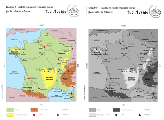
Think of a map of France. What colour are the forests? The rivers? The mountains? Green, blue and brown of course! These are their natural colours and therefore the ones you would expect to see. These colours are “logical”: using them makes the map easier to understand, and easier to remember. On the other hand, relying on colours that are too strange – a fluorescent yellow sea, a pink forest… – can confuse the reader.
Similarly, it is important to be consistent. If blue is used for rivers, it should not also be used for roads or mountains. Otherwise, there is a danger of confusion!
Meyer and Fortner offer a number of other tips. In bulk: make sure that the colours are clearly distinct from each other, that they combine harmoniously, that they are designed to be clearly visible to everyone, including those who suffer from colour blindness…
A key issue for sharing scientific data
It can be difficult for the non-scientist to navigate through the mass of data produced today. Yet, for citizens to make sound decisions on key issues – climate, pandemic evolution, vaccination… – it is crucial that they understand the scientific data presented to them.
To simplify scientific information and clarify researchers’ findings, “data visualisation” – also known as dataviz – is essential.
Lyn Bartram, director of the Vancouver Institute for Visual Analytics, says that “data visualisation is a language. Basically, you’re trying to tell a story, and colour plays a very important role in doing that.”13 Bartram adds that since data visualisation is now used everywhere, it is no longer just a tool or a mean to reach an end for scientists, ” dataviz has entered our everyday conversations and influences our decision making in society”.
Ed Hawkins, one of the authors of the 6th Environmental Report of the IPCC – Intergovernmental Panel on Climate Change – agrees. “We need to be able to reach a very wide audience, not just to inform but also to guide political decisions and help people respond to the dangers that threaten their way of life “14. This is why the IPCC calls on several graphic designers to “transform complex visualisations into simplified infographics”, to ensure that they are easily understood and readable, that colours are consistent and used appropriately, and that they are suitable for reading by colour-blind people…

One of the most widely used colour scales in science is the rainbow colour scale, which takes advantage of the full spectrum of colours in the rainbow. Although it is very pretty, this graphic representation raises some problems: colours are difficult to rank (in which order should red, blue, green, yellow be placed? People like to use the rainbow because it attracts the eye, but once you really look at it and try to understand what is going on in the image, it all falls apart,” says Jamie Nuñez, author of a study15 on a colour scale designed to overcome the shortcomings of the rainbow scale.

While the visual rendering of the rainbow scale is very pleasing, this overflow of colours, instead of facilitating the analysis of the data, sometimes obscures the situation. Researchers at Harvard University16 have shown, for example, that replacing 3D models of arteries in all the colours of the rainbow with 2D representations using a scale from red to black made it much easier for doctors to read and understand the images. Their rate of correct diagnosis of heart disease jumped from 39% to 91%.
It sounds crazy but it’s true: the right choice of colours can sometimes save lives.
-

Air quality, a public health issue!
Why care about air quality? Educate, mobilize and reinforce engagements and achievements in order to reduce ...
-

A new showroom in Dubai
To keep on offering the best client service, our experts consider every aspect, restraint and requirement to ...
-

Happy New Year 2020
RISO wishes you a wonderful year! In the beginning of this new year, we want to thank all our customers and ...
